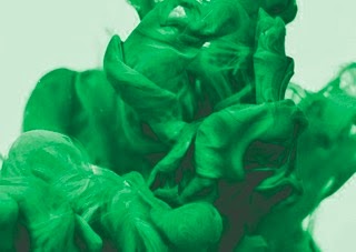
Textures
Using secondary images I experimented with a range of imagery using duo-tone method to introduce the colours of green that they wanted.


Logo
For the logo I experimented initially with my first idea of creating a cassette style logo using the geometric elements of the shape to create simplistic logo. I created a series of designs that used black, green and with smoke in to fit in with the clients requests to see these variables.


I then experimented with manipulating the 'O' into a cassette / vinyl style as another alternative to introduce the context of music.

Finally I experimented with a simple, bold san serif to fit in with the clients requirements. I worked with a wide tracking for this logo design to reflect the feeling of something flowing and to create an airy feel to the typography.
After the logo designs I sent some examples to Rob to get some feedback.
Contact

Overview
I will now develop designs and work more with putting them into context to allow the clients to see how the brand can be applied.
No comments:
Post a Comment