Showing posts with label BRIEF 09 - YCN WHISTLES. Show all posts
Showing posts with label BRIEF 09 - YCN WHISTLES. Show all posts
Monday, 4 May 2015

Thursday, 19 March 2015
BRIEF 09: EVALUATION
Overview
The YCN Whistles brief has been an alternative and exciting brief to have completed, although having an interest in Fashion the majority of my briefs this year have been music directed so it was nice to engage in another passion of mine. As a collaborative brief, I felt that myself and Jasper worked really well together and came up with some good concepts and deliverables for the brief.
For this brief I took on a Art Direction role as well as a Graphic Design role and was really beneficial in me seeing how I can work in both roles and also enhancing my abilities in each of these sectors.
Doing a cross - course collaboration with Oscar and Elliot allowed our work to be a success and I think was a really beneficial aspect of the brief in regards to the production of the work. Using people that have experience and knowledge within that field know the capabilities and limitations with your ideas so this helped us create work efficiently. I also think using materials such as vinyl and the laser cutter was alternative methods for this brief, we took on a hands approach apposed to mocking it up which definitely gave more visual depth to our work and outcomes.
Also the concept development and research into the project heightened my knowledge of the brand and the context of the brief which was perfume. This enabled myself and Jasper consider all aspects of how to tackle the brief from the bottles to even fragrance sticks.
On reflection, we completed the brief in just under 2 weeks, so it would have been nice to see what we created if we had more time, however with the time we did have we did create a lot of outcomes at a professional standard which I am pleased about.
Also to develop my skills in crafting and packaging, I know this is not one of my strengths and could be a process I work on developing further if I come into this process in future briefs.
The YCN Whistles brief has been an alternative and exciting brief to have completed, although having an interest in Fashion the majority of my briefs this year have been music directed so it was nice to engage in another passion of mine. As a collaborative brief, I felt that myself and Jasper worked really well together and came up with some good concepts and deliverables for the brief.
What skills have you developed through this brief and how effectively do you think you have applied them?
For this brief I took on a Art Direction role as well as a Graphic Design role and was really beneficial in me seeing how I can work in both roles and also enhancing my abilities in each of these sectors.
What approaches / methods of design production have you developed and how have they informed your design development process?
Doing a cross - course collaboration with Oscar and Elliot allowed our work to be a success and I think was a really beneficial aspect of the brief in regards to the production of the work. Using people that have experience and knowledge within that field know the capabilities and limitations with your ideas so this helped us create work efficiently. I also think using materials such as vinyl and the laser cutter was alternative methods for this brief, we took on a hands approach apposed to mocking it up which definitely gave more visual depth to our work and outcomes.
What strengths can you identify in your work and how have/will you capitalise on these?
The strengths within this brief that I can identify are the time and people management, I was able to book the correct facilities and direct people in the photoshoot to ensure that we had everything we needed. I also think my skills in type, image and composition also came into play for this brief with my proposed campaign posters ideas and web presence. Also the concept development and research into the project heightened my knowledge of the brand and the context of the brief which was perfume. This enabled myself and Jasper consider all aspects of how to tackle the brief from the bottles to even fragrance sticks.
What weaknesses can you identify in your work and how will you address these in the future?
I think the only downfall of this brief was our packaging and crafting, with this not going to plan we chose not to submit this, but will be something myself and Jasper could push further if we have time to add to our portfolio.
Identify things that you will do differently next time and what do you expect to gain from doing these?
Also to develop my skills in crafting and packaging, I know this is not one of my strengths and could be a process I work on developing further if I come into this process in future briefs.
BRIEF 09: VIDEO CAMPAIGN
For the video campaign we did a cross course collaboration with Elliot Tebbs from 3rd year DA/Video animation, I previously worked with Elliot for my Re-Mix exhibition, so it was nice to collaborate with him again and maintain a good working business relationship.
From my previous research and development ideas from my previous posts, the magic was left to Elliot to interpret that!
From my previous research and development ideas from my previous posts, the magic was left to Elliot to interpret that!
Final Campaign
Overall I think the video came out perfect and to a professional quality that represents the Whistles brand and I am really please again to work with other creatives and make more interesting and alternative outcomes for briefs. This will be a nice feature aside from out boards to show how the brand can work on a wide range.
Wednesday, 18 March 2015
BRIEF 09: PRODUCT PHOTOSHOOT
Myself and jasper set up some photography equipment and began taking product shots of how the bottle and packaging would look in the brief.


Unfortunately the crafting of our boxes were not excellent, however this can be altered in photoshop.
Proposed Final Imagery


Overview
From the queries about the packaging the photography looks amazing and the monochromatic colour really work for the brief. I can't wait for submission as I feel myself and Jasper have created a really strong brief.
BRIEF 09: WEB PRESENCE
For the online campaign I decided to create some web mocks ups of how the promotion of the fragrance could work on the Whistles website. I looked at the existing website for influence of the layout and structure.


The overall aesthetic is minimal and crisp with a lot of white space and dominated by imagery. The layout is very regimented and clean so this is something I will consider when designing the web pages for the campaign.
Home
For the homepage there will be a feature on the fragrance, with the imagery of the models for the brief.


I started to experiment with man, woman and them combined to follow with our theme of connection.


Man
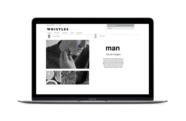
For the man fragrance page I wanted to highlight the fragrance and how it would be used and the ingredients within the fragrance. I again began to experiment with layout and type arrangement that emulated the whistles website.
— Man notes
I also collected imagery from the proposed fragrance notes and edited them to black and white to go with the rest of the campaign.


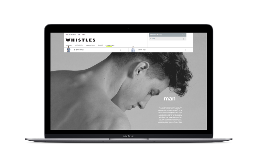
I began to experiment with full length imagery but it didn't really work with the whistles style. So i continued to used a spaced out grid.


Woman
Following on from the previous male design I wanted to keep the same structure for the women's also.
— Women notes


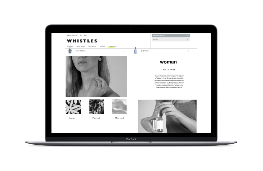
However I wanted to develop it a bit further to see other possible layout outcomes.


In experimenting with a few designs I felt that the pages should be consistent between the man and woman and decided to possibly use the first design.
Social
For the social page, I came up with the term 'whistles scentsation' which is a added fragrance page feature where by posting images on Instagram and Twitter with the referenced hashtags #whistlesman #whistleswoman and their images, name and caption would get featured on the live website.


I took some images with the fragrance bottles in different contexts and used a cube like grid as you would see on both social media sites for the extended 'scentsation' page.


I experimented with both the monotone and full colour images but I felt the full colour image were more realistic and appealing to what the page was about, as it is an extension of the branded campaign with other people images involved.
Finals
After showing the developments to jasper these are the final web pages we chose for the brief.

With all our other deliverables I felt like the web pages were another good outlet to show how our idea can be transferable across different media.
Subscribe to:
Posts (Atom)