I collected an array of images that used polaroid qualities, as a source of influence of image manipulation and layout.


These collection of images experiment with a multitude of polaroids on a page and really work in enhancing the overall visual image or creating and interesting guide to work by. This is something I can experiment with, for the layout of my design.


A collection of great ways to showcase a few different pictures while leaving in a striking, strong background image to tie them all together! landscape photography, abstract art and graphic overlays are a great match.
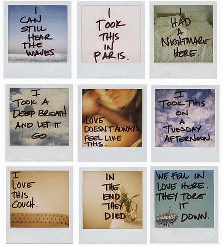
I really like the hand written font on the polaroids which creates a personalised effect, also this style of font enhances the vintage element.


Marc Jacobs campaign simplistically works with using layout and type arrangement to create a polaroid style grid, this is also something I can consider if putting the images into polaroid frames isn't successful.

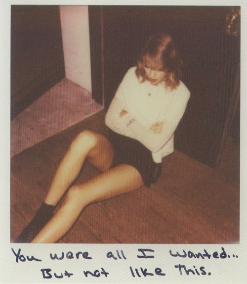

Musicians such as Taylor Swift and 5sos also used this method of design for their promotional material, these artists also use a handwritten style font, experimenting with just one polaroid image or a multitude.
Overview
From this visual research I've found a multitude of ways I can experiment with type and layout for Marcus's poster design and also reflect on how other musicians have used utilised this style. I will now move forward with experimenting with different designs.
No comments:
Post a Comment