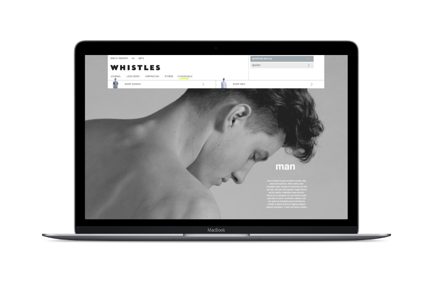
For the online campaign I decided to create some web mocks ups of how the promotion of the fragrance could work on the Whistles website. I looked at the existing website for influence of the layout and structure.
The overall aesthetic is minimal and crisp with a lot of white space and dominated by imagery. The layout is very regimented and clean so this is something I will consider when designing the web pages for the campaign.
Home
For the homepage there will be a feature on the fragrance, with the imagery of the models for the brief.
I started to experiment with man, woman and them combined to follow with our theme of connection.
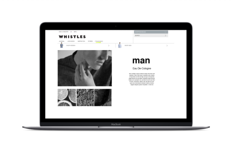
Man
For the man fragrance page I wanted to highlight the fragrance and how it would be used and the ingredients within the fragrance. I again began to experiment with layout and type arrangement that emulated the whistles website.
— Man notes
I also collected imagery from the proposed fragrance notes and edited them to black and white to go with the rest of the campaign.
I began to experiment with full length imagery but it didn't really work with the whistles style. So i continued to used a spaced out grid.
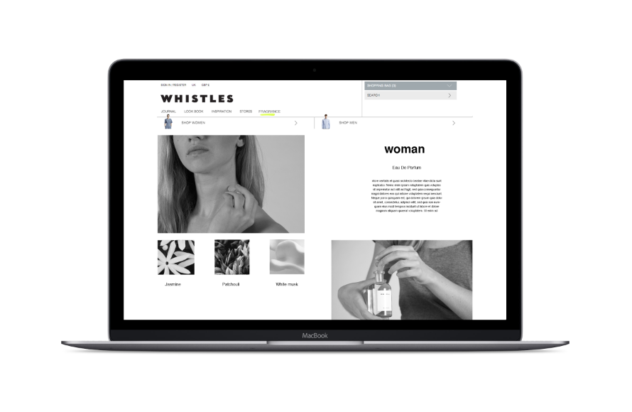
Woman
Following on from the previous male design I wanted to keep the same structure for the women's also.
— Women notes
However I wanted to develop it a bit further to see other possible layout outcomes.
In experimenting with a few designs I felt that the pages should be consistent between the man and woman and decided to possibly use the first design.
Social
For the social page, I came up with the term 'whistles scentsation' which is a added fragrance page feature where by posting images on Instagram and Twitter with the referenced hashtags #whistlesman #whistleswoman and their images, name and caption would get featured on the live website.
I took some images with the fragrance bottles in different contexts and used a cube like grid as you would see on both social media sites for the extended 'scentsation' page.
I experimented with both the monotone and full colour images but I felt the full colour image were more realistic and appealing to what the page was about, as it is an extension of the branded campaign with other people images involved.
Finals
After showing the developments to jasper these are the final web pages we chose for the brief.


No comments:
Post a Comment