One
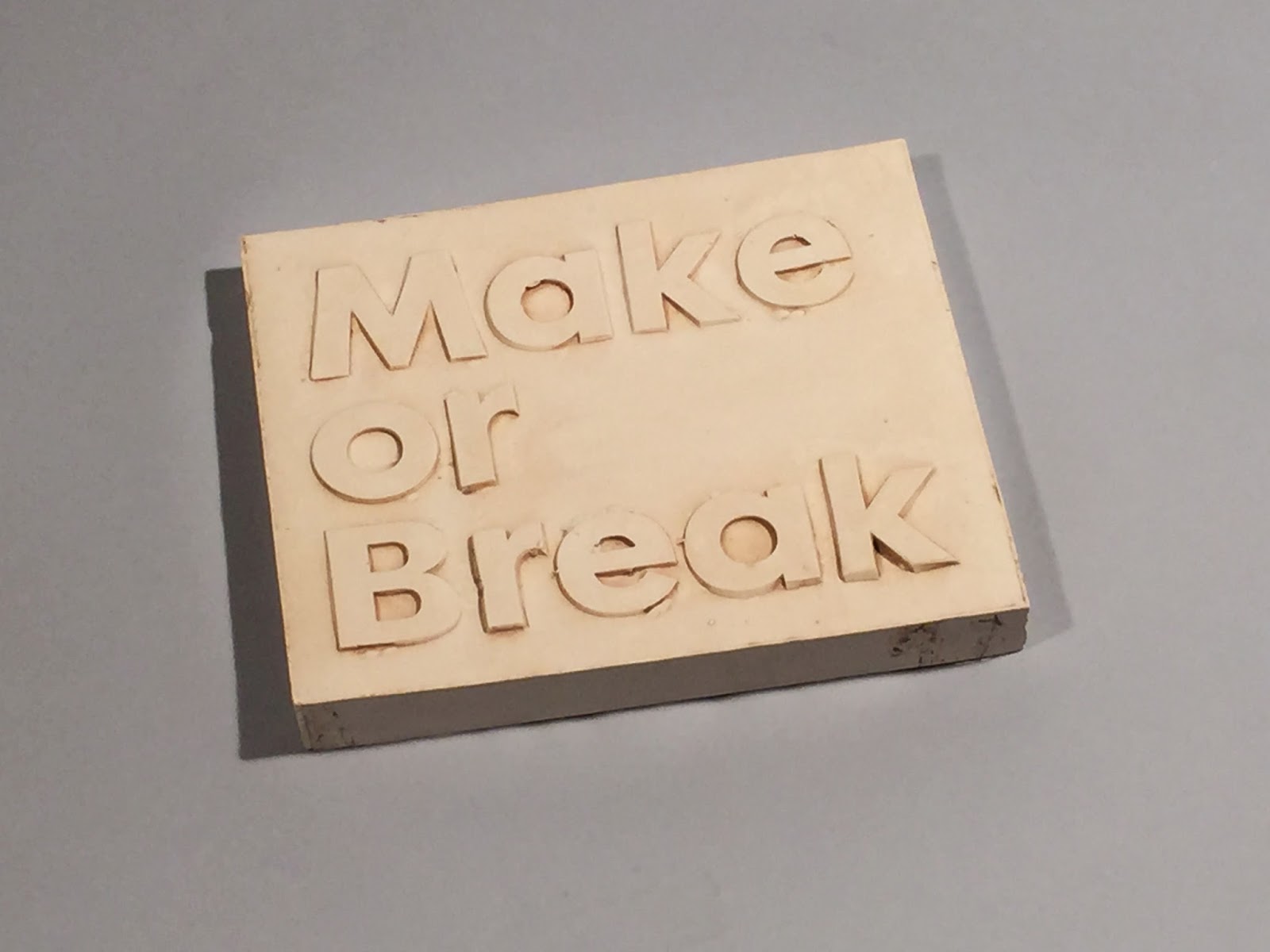
For the first concept we laser cut the type out of wood and acrylic to break the letterforms against bright backgrounds for the brief.

Photography


Finalisations


Two
The second concept was to create the type of out of plaster and to break the single letterforms, the process of this was created in fine art ceramics and is documented photographically below.


Photography


Feedback
In the development of our work we decided to send over some initial developments to Lee from Peter& Paul to get some feedback and see if we was going in the right direction. We then received a PDF of feedback on what we consider for the brief.
Three
From the feedback we decided to make a mould from the type using a more bolder font and following a similar process from process 2.


Photography
We the collaborated with Oscar from photography for some final photo's for the campaign experimenting with breaking the mould and trying to make it legible.


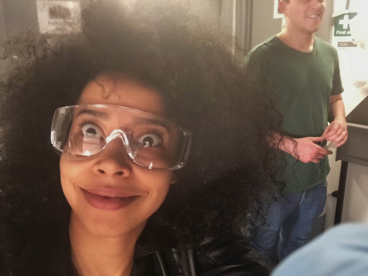
(wearing protective eye wear for the shoot)


(then we worked the grave yard shift finalising designs for our pitch)
Overview
The developments for this brief has to created really quickly as we only had 2 days to create such large scale designs, but with working with the boys we created a selection of really interesting outcomes and I am really proud of our hard work and the enthusiasm in the group. We all worked really hard to push these ideas and follow the feedback from Lee, so hopefully it all pays off!
No comments:
Post a Comment