I decided to research into existing record label branding and logo's as a source of influence, on how I could design the logo and how it can be transferred across a range of media.
— Logo

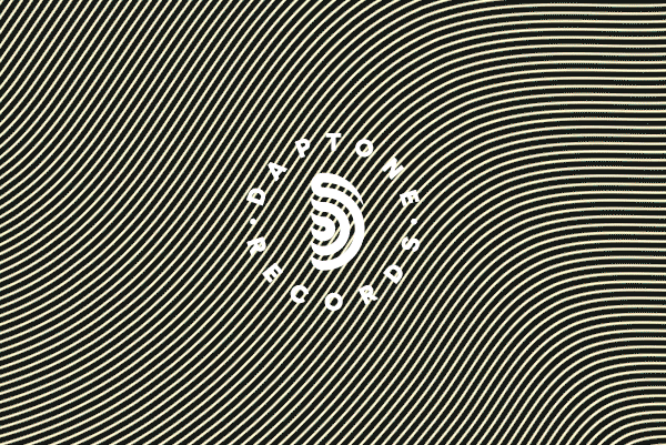
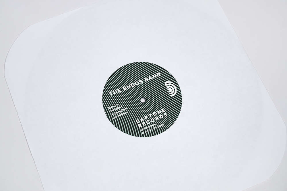
I really love the simplicity of this logo that links back to music and the wheels of a cssaett this could be something I consider in the production of my logo.


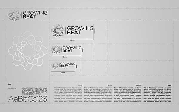
A san series typeface is bold and easy to read across a range of mediums and would fit in with the clients needs.

Subtle refferences to music notes could be introduced into the typography of the logo to establish the context of the brand.

— Brand


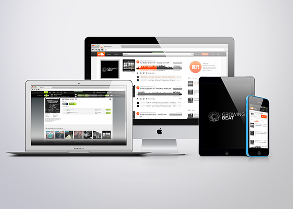

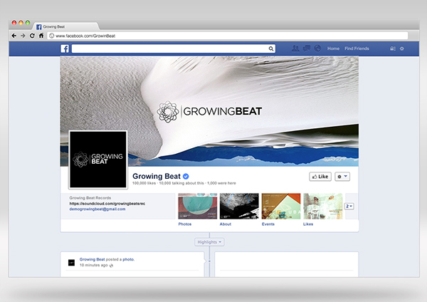
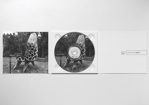
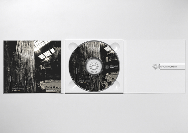


Overview
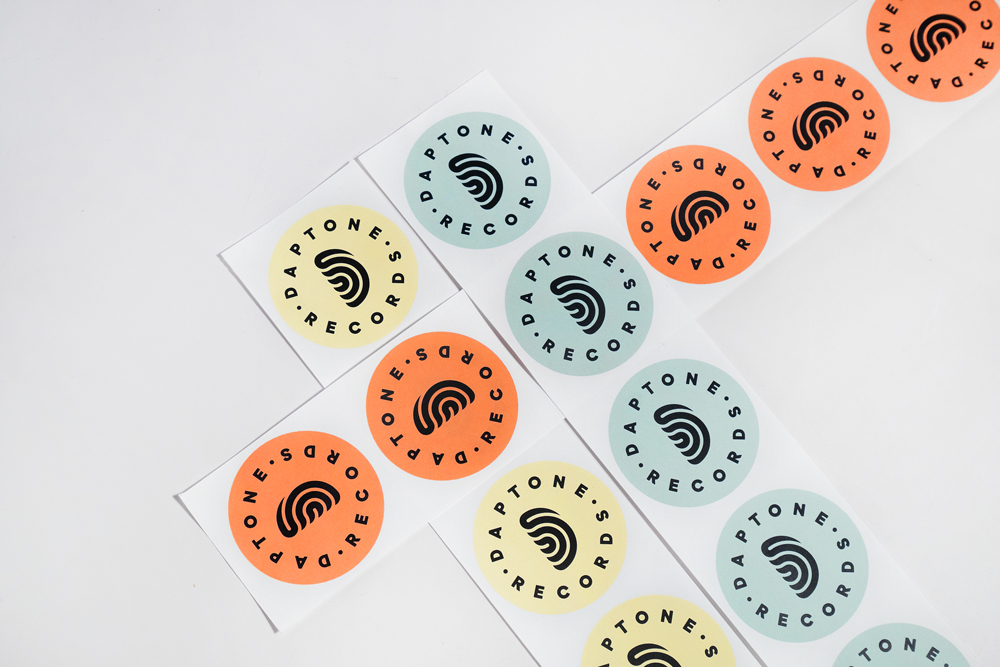
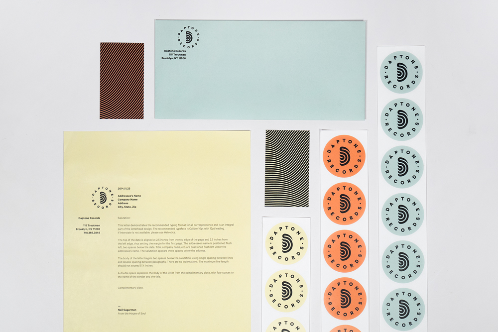
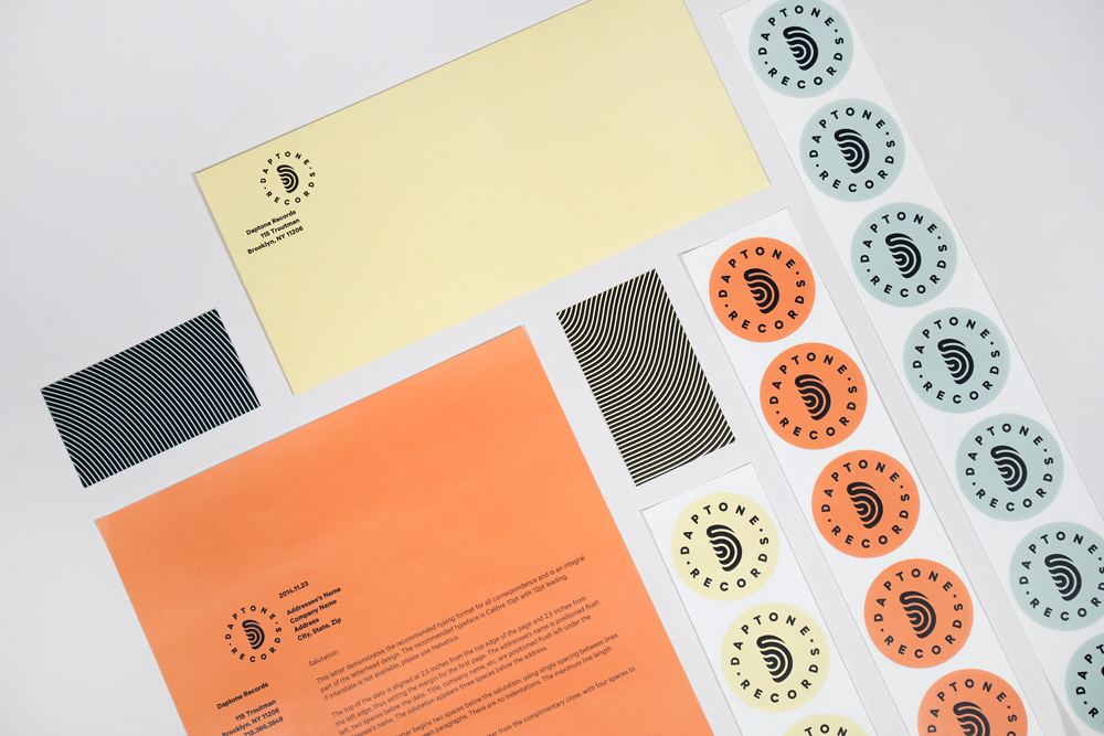
From my visual research and what the clients have already shown me and asked for I think working with a simple san serif font would benefit the brands image and work it with overall. I really like the idea of experimenting with simple san serifs and subtle music hints in the logo like a cassette to fit in with the brands alternative vibe.
No comments:
Post a Comment