F / B Cover
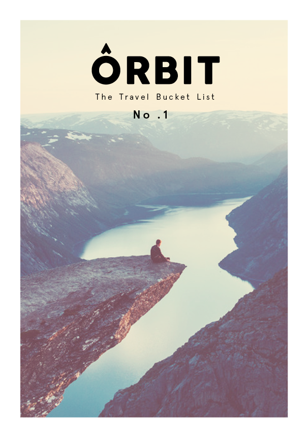
For the front cover I wanted to use an image of someone travelling to reinforce the context of the publication. I applied my logo and the book title in a variation of branded colours to get a well rounded view of what it could potentially look like.


From all my designs I felt the black worked best with the image and didn't get lost within it. I also think a simplistic approach to the type and logo worked best for this as the images speaks for itself.
For my contents page I wanted to create a sneak preview of the destinations of the places, so I designed a photo style strip to replicate this.


However it didn't make much room for the text or title for the page. So I decided to remove the introduction teaser but it just looked out of place.


However some of the images where a little bit to dark so I tried changing the colour of the titles. But decide to lower the opacity slightly to make it stand out. I then added a little sub title underneath the header to fit in with the rest of the publications aesthetics.
Introduction
For my introduction page I wanted to use an image of aeroplane to indicate the start of a journey. I played around with some images and the layout of my content.


But after finding a high res image of a plane I though it would act as a nice feature to have the image working across a double page spread just to give the book a different layout.
Map
For my publication I initially wanted to have a scratch map, so that it would be interactional for the consumers and a nice tactile feature. However when researching into how to produce it, I decided that it would be better as an accompanying piece to the project at a larger scale because there could be complications with the quality of it when the book is bound. So I resolved this issue by having another map inside that highlights the specific points on the map that are featured in the book.


I experimented with a variation of vectors and used the primary orange colour in my branding to develop my design. I also introduced my secondary logo to pin point the destinations so the consumer can get an exact idea of where they could be travelling.
Grid + Layout
For my content pages I used a 4x6 grid with 3mm gutter to align all my artwork.


From my initial layout designs I decided to choose this design as it the boxes will draw anttention to the images and replicate a snap shot style, which is relevant to the context of travelling and sightseeing.
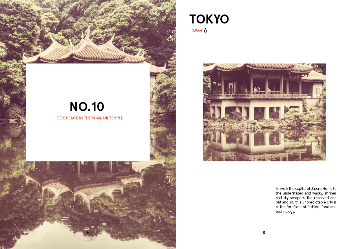
Title Pages
When experimenting with my layout design I had to develop if further due to the wealth of content. I decided to take elements form the design and spread it across two pages. One box highlighting the destination and the bucket list quote for the introduction pages. I replicated this across this design across all of my pages to keep consistency throughout the publication but alternating the content to add visual variation.
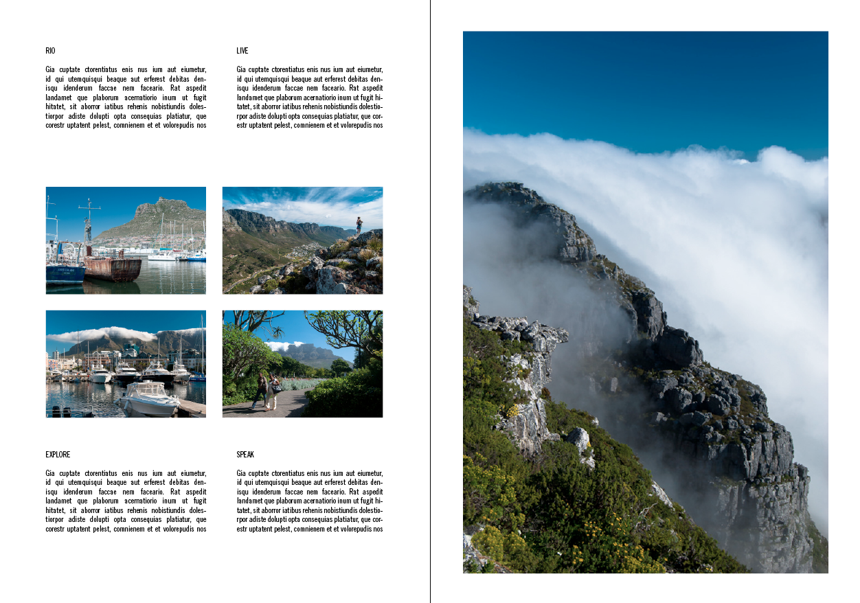
Content Pages
For my content pages, I was unsure initially on how i could spread out the information, however in keeping with the box / snap shot style theme I decided to create a grid of 4 style for each section of information. I would again use this across all the content pages to maintain consistency.
London


— Content —


Reyjavick


— Content —


— Content —


— Content —

Rio De Janiero

— Content —

Cape Town


— Content —


Cairns

— Content —

Goa

— Content —

Hong Kong

— Content —

Tokyo
— Content —

Overall I think my publication has signifcantly developed from my inital design, I took on the comments about adding more colourful images and I think this has deffinatley benfited the context of the publication and will give the consumer a more well rounded idea about the destinations that they could potentially travel.
No comments:
Post a Comment