Due to the publication being very photography based, I will have to source a lot of photography that will work cohesively in the publication. I decided to look into some designs that use world photography as a source of influence to see how I could present and possibly edit mine.


I looked at Jiani Lu's publication about travel and I really liked the style of photography she has used and this is the style I really like as it brings out the colours in the photography and has an old film quality.
However in my hunt for images it has been a really challenging task as all the images have different filters, shapes and sizes. This is a problem I didn't perceive in the process of my project and I don't have the time or money to take my own. A way in which I think I could overcome this problem is by either making all the images black and white to maintain consistency with the publication and keep to the colour guidelines. Again however I think this could possibly take away form the visual quality of the publication, so this will be something I can experiment with.
Alternatively if that doesn't work I will look into possibly adding a consistent filter effect to my images and experimenting with different styles.
Black + White
As an idea I thought I could experiment with some images taking them and changing them to black and white for my publication.
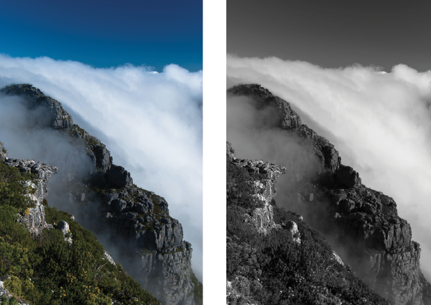
On the left hand side is the original image and to the right is the edited image. Using photoshop I simply changed the images mode to 'grayscale' and this was the outcome. Comparing the images I think the image still looks quite striking but this maybe due to all the different textures within the image that makes it stand out.

I then decided to experiment further with the brightness and contrast tools to see how they would make the image look. Again it defined the image more making the mountains and skyline stand out more. This is something I can continue to experiment with in the development of my publication to see how it works.
Duo - Tone
After experimenting with black and white I thought I could experiment further with the aspect of using one colour. Using my black and white image I simple went onto mode > duo tone and experimented with orange.


I then decided to experiment with white in the swatch to see how that would look alternatively.


To the left was the original black and white image and to the right is the image with the brightness edited. In these experiments I don't think they work really well with aesthetic I want the publication to look like and the quality of the image is jeopardised.

I then tried an alternative way of using duo tone by using a full colour shape, placing it over the image and then lowering the opacity. I lower the opacity to 65% in this image and I felt it came out better than the previous experiments above and if I wanted to move forward with this style I would choose this method.
Filters
Another way in which I thought I could experiment was with photo filters. I looked into some online actions to create soft filters over images and experimented with them below. The original images are on the right and the edited are on the left.

Valencia — the effect gives a more crisp design to the image and enhances the colour by introducing warm tones.

Orange — the effect makes the image look more soft and the introduction of orange really makes the image more warm and work well with the colour scheme of my publication.

Bubble Tea — the effect gives the image an old film filter which I think makes the images look really nostalgic and inviting which is what I want the publication to communicate. This is an effect I will consider moving forward with.

Red Tones — the effect create a slight duotone effect to the image but still maintains its visual integrity. I really liked the subtle tones that give the image a alternate look.
From all of my experiments I think it has benefited me with the problem I had when searching for image that would work cohesively in the publication. From the experiments I aim to move forward with using, black and white, bubble tea, valencia and the orange effects to see how they work in my publication together or individually.
No comments:
Post a Comment