I decided to research into some existing poster designs to get some influence on how I could layout the type and possible colour experiments.


The simplicity of a solely typographic poster with a bold colour really works to grab attention.

Using hand rendered type created a personalised feel to the poster and like it's a letter to the audience whilst still maintaining contemporary and modern.


I really like the unorthdox layout of the type within the poster that creates a multifaceted view on information.

A gradual gradient background is really vibrant and eye catching, this could be something I could consider when selecting colour for my poster

The simple clear type and bold colour works well in clearly showing the message but in a visually attractive way. Due to the poster being used for multiple areas for this brief this could be something to consider for adaptability.


These poster variations include some use of a pattern, this really add to the typography and adds depth to the overall aesthetic.


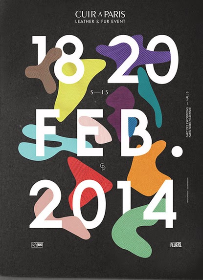


I really liked the experimentation of the type which adds a 3D / movement aesthetic, experimenting with how the text is visually edited is something I could consider.

Overview
From the visual research I have now identified a range of ways I can now execute this design. I think creating a design this uses simple typography with bold colours or an introduction of a pattern would be the best way to visually engage the students to engage with the nation student survey.
No comments:
Post a Comment