Porto.
The city needed a visual system, a visual identity that could organise and simplify communication with the citizens, and could at the same time define a clear hierarchy, bringing together the city and the city hall. We needed to represent Porto, a global city, the city for everyone.


Metro Rail
Metro transport is a future proposed (privatized) integrated metro system aimed towards business passengers traveling between New Zealand’s primary business hubs. It serves New Zealand’s premiere business route form Auckland to Wellington, which caters for middle to high-income “white-collar” businessman. The idea is for the metro system to be faster, cleaner, more reliable, and more efficient than the current conventional travel modes with a high level of customer service and an exceptional onboard business experience.


BTLK Group
Baltic Transportation and Logistic Company – is a mature and well-established team of experienced managers in the organization of the transportation process on the railways of the Russian Federation, CIS and Baltic countries. Main activity company aimed at the management and leasing of huge personal park wagons.


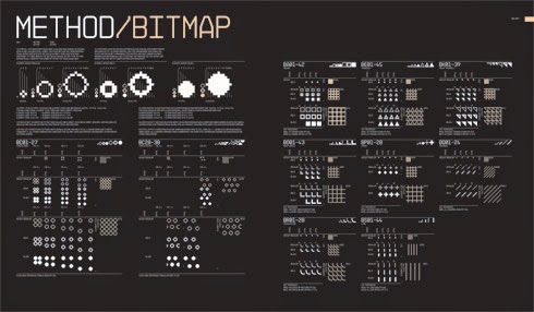
A wide variety of patterns to use in Capital North's daily work. Patterned surfaces, backgrounds, textures, wallpapers or moving images. This could be something we use to define the different cities through this style of graphics.


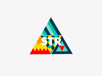
I really like the colours of this branding and the simplistic but 3D element of the logo which links to the theme of connectivity. This style could be something we could consider for capital north.


.jpg)


Düsseldorf, created by design studio Betty und Betty. Brand concept and type promoting the diversity of the German state capital. The new overarching umbrella brand logo is a unifying element of all communication activities within the city, and consists of three elements.


City branding of Alenquer in Portugal, I love how they have used iconic imagery in the city to devise a logo and pictograms, to fit in with the cities heritage.


.jpg)


City branding using shapes and colours in a tonal range to define the city, this pattern is really strong and creates a bold but consistent visual aesthetic.


A bold and considered logo design that uses rich colour, but is adapted in a clean and simplistic way. I really like how this branding not only considers the city but also the cities branded merchandise.


Overview


Overview
No comments:
Post a Comment