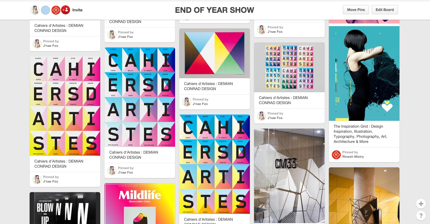
I looked into a collection of branding and conceptual events branding, posters that I felt would be influential for the brief. I also set up a group Pinterest board were we could easily send and share ideas.

This poster series represents the meeting point between art created by artists and word written by authors as well as the visibility that an Art publication can offered.


In this project each parts are highlighted by a typographic and sculptural composition. With the use of precise filters, the 4 basic offset colors, we created a series of unique, multiple and colorful posters with different outputs based on the printing process, thanks to the manipulation of paper and colors management. Resulting this engaged, collaborative and rhythmic vision of contemporary art scene.


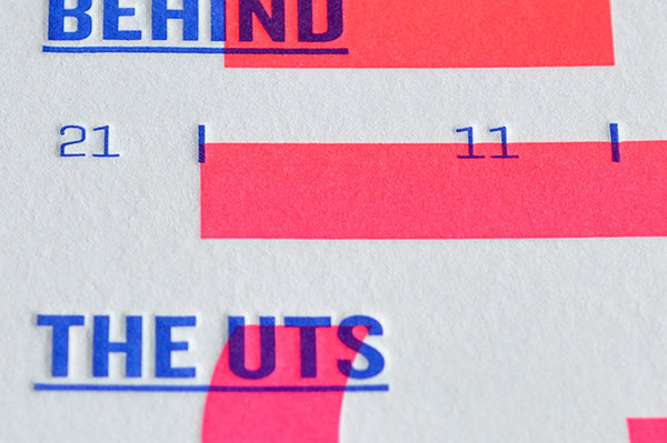
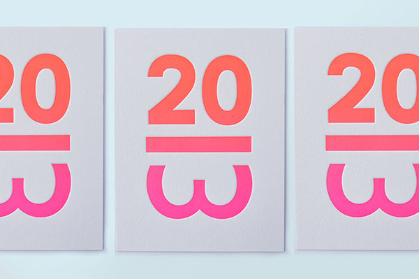
Rebranding of The Music Broadcasting Station (formerly 2MBS-FM)—a classical music radio station in Sydney. A new logotype and campaign has been developed to lift the profile of the station and propel it confidently into the mainstream.


Using a simple graphic device—the vertical separator line between bars found in sheet music—an engaging dialogue is created between the station and its listeners and flows consistently through all typographic applications.


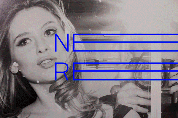
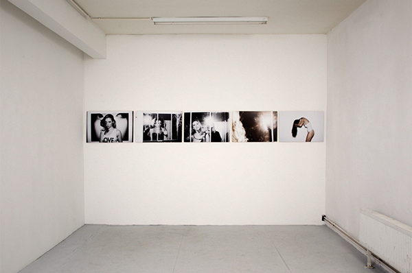
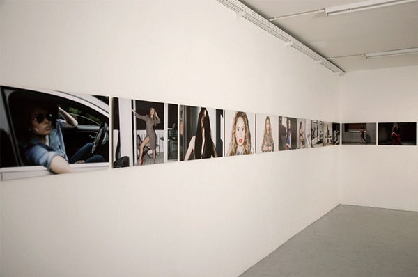
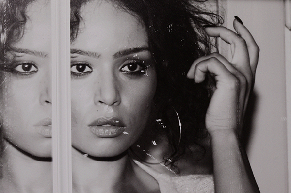
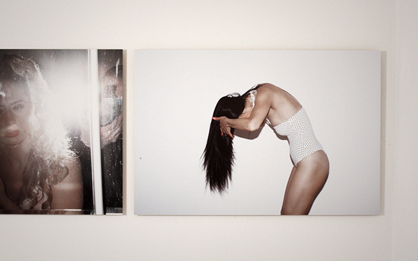
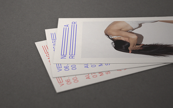
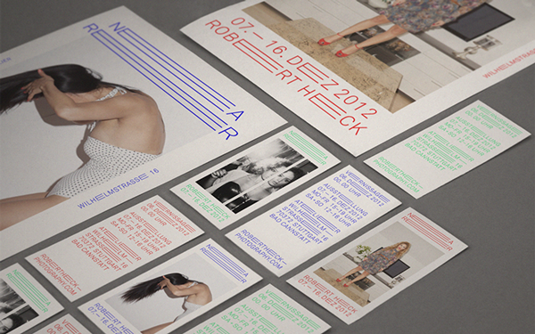
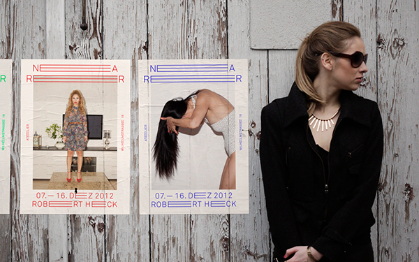
Conceptual exhibition and installation of the self initiated project "nearer".
Exe


The idea of possibly including some mini prints of the art work and incorporating them into postcards with information of the event of the back could also act as flyers.
RoAndCo Studio


In looking at these designs I want to use a single bold colour within the design and possibly a monochromatic pallet to make items such as the logo and other materials stand out.
I’m Glad We’re Different
brings together Beatrice, Izziyana, Pete & YT, four local artists who come from different backgrounds and disciplines. Collectively, they explore the meaning of individuality and self, and the result is a delightful smorgasbord of art works done in differing mediums, each close to their creator’s heart and opinion on the theme.
-
Work: Branding & Exhibiting Artist


Equal Opposite


Danlou Exhibition

For my exhibition I looked into a multitude of ways that I could display my artwork and items I could consider when curating the space.
Exhibition Space Design
I also decided to look into a range of ways to curate the space for the potential exhibition and how our designs could be transferred on different platforms and materials.
Boxes + Displays


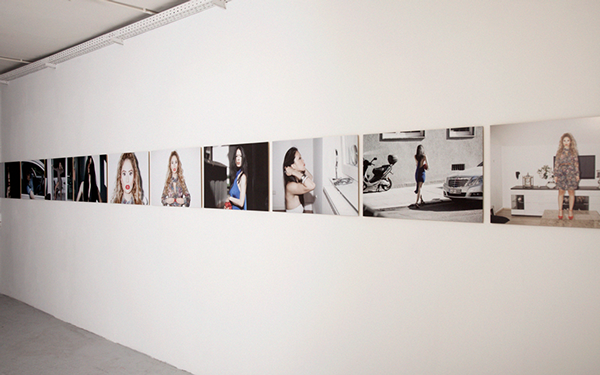
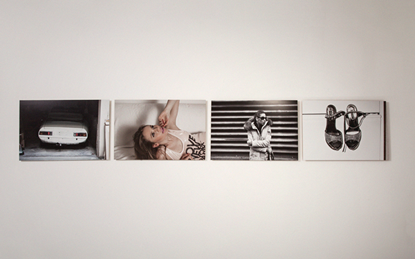
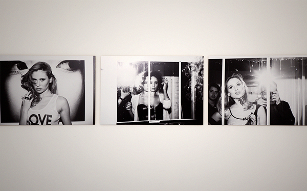
Artwork Display


Type / Image Display


3D Type installations could be used for the title of the exhibition, using perspex or wood.

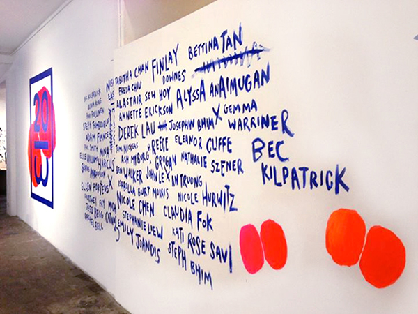
Vinyl lettering to be used on the walls of the exhibition and could be used to define certain focal points and to highlight artwork.
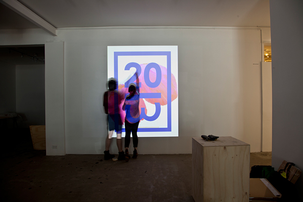
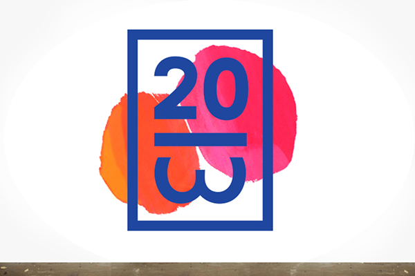
Projections


There are a multitude of ways in which projector could work within the exhibition space, looking at a few variations gives me a range of ideas on how we could use this.
Feedback Displays

Simply and easy way for people to leave comments and feedback about the exhibition, pencils implemented within the design works really well.


Using hooks to hold comment cards, could be a discrete and interesting way to keep them placed.
Promotional


A small board we could use outside of the exhibition to announce the exhibition is on, and act as a part of way finding and signage.
Overview
Collecting different images of exhibition and space design has enabled me to get an insight into the potential ways in which we could design and curate the exhibition.
Highlights
Highlights
- Colour system or pattern to break down the different design departments
- A simplistic design that is transferable across a range of media and materials
- Photography of students adds a personalised factor to the work and setting.
- Consider print, digital and 3D outcomes.
No comments:
Post a Comment