With the brief all done, in my first selection of briefs, I wanted to brand my own record label with already establishing a logo for an existing brand I decided to extend the brief further and create outcomes of how the logo and brand could be expanded.
I noted a list of things from my visual research and what the company had already planned to do and decided to digitally mock up some potential outcomes that I could pitch to them later on.
- Album Art.
- Event Tickets.
- Event Posters.
- Merchandise — T.Shirts, Bags + Badges.
- Office Presence.
Branding Guidelines
To start the extension of the brief I wrote out a set of branding guidelines that FLOE could potentially follow and would act as a guideline for myself to ensure that the branded image succinct.
— Logo
With me sending over a variation of logo's, I was not sure what logo the company had officially chosen. With that in mind I chose the design that I felt best reflected the brand, which was the cassett style one.
Along with the colour chosen for the brand which was a dark green I decided for the extension to use a tonal range, particularly focusing on a lighter green to concide with it's ambient style of music.
— Album Label
From my research into Daptone records, each record had a label that referred back to the companies name. With this in mind I started to build up a series of labels that could reflect the artist name and single alone with the logo to be imprinted onto the album art and other branded items.


I then created this as the final outcome the label represented a flag to symbolise that they are making a mark in the music industry and also reflects the letter 'F' which links to the brands name.

I then created a little contact sheet of all the variables in the branding guidelines consider type, font and colour as a final guide to work from.
Album Art
Due to this being proposed album art I sourced secondary imagery for the covers from the photography page in designinspiration. I chose images that I felt were alternative and really different to fit within the genre that FLOE represents.


Using an online mock up I experimented with a selection of ways that the album art could be positioned on their website or in context to show the artists and their covers. The covers were also selected to represent the names of the songs, which I also proposed. This visual imagery will link directly to a alternative style of photography for each artist and will be apart of the FLOE brands house style.
Merchandise


I then started to consider how the logo could be transferred through merchandise and mocked it up on a series of outlets to push the brands image.
Promotional
For the promotional side I then considered the events that artists could hold or the company events for networking and created a series of outcomes from this.


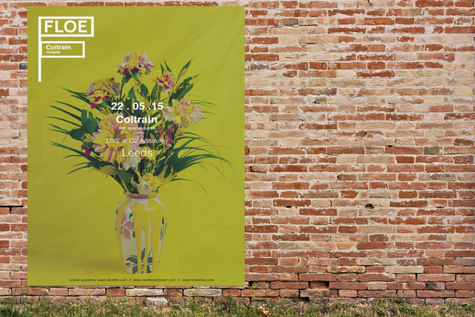
The artist's promotional material is utilised through continuing their album artwork into the promotional material to create iconic imagery for each artist and to detract away from ordinary press shots to fit in with the labels alternative vibe.
Studio
For the office presence I created a selection of interior and exterior mock ups of how the potential office would look.


Overview
Although this was not apart of the initial brief, I have really enjoyed expanding the potential image of FLOE and how it could work in context. I always like to consider product, range and distribution when branding and I have explored this in the expansion.
No comments:
Post a Comment