Swtr


The Swtr look book uses similar tones to our branding and the gradients used on the pages works really well and the double pages spread images is something to consider.
Moxam


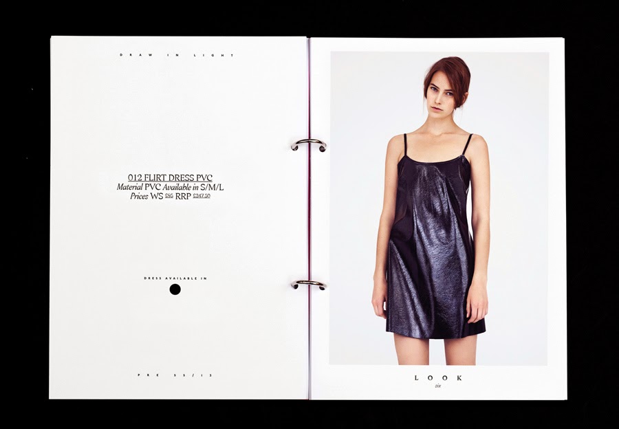
The Moxham look book uses a lot of detail shots juxtaposed to full length shots that create a clean but effective layout allowing the model to see how it works in context and also the shots alone.
ANOI


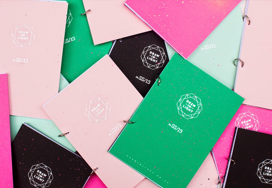
The small inserts in the cover is a really clever idea and something we could incorporate with our look book, with the idea of creating mail shots that could be inserted in the look book.


A collection of images from Poster Mag, for layout influence. I really like how the imagery is framed by the pages.


The Hannah look book uses really clean inserts to detail what's in the imagery letting the photo's speak for themselves. Also the colourful stock which would work really well with the colour that has been chosen for the packaging.


I love textured background used in this look book, with our photography being quite etherial and on location this is another feature we could definitely use to add visual variation and depth to the the page design.


Kurashikku, is a collection of rings that draws on the deconstruction of classical settings, and re-creating gems and other classic jewellery forms in solid metals including silver. The mixture of juxtaposing photography again really works with highlighting the detail within the jewellery and the layout is clean letting the photography speak for itself which is imperative for this brief.


Pearly Queen London is a new fashion forward swimwear brand, inspired by the outgoing London girl who wears her swimsuit from pool to party across international beach and festival destinations such as Coachella and Ibiza.
Overview
The research into look books has informed the different stock, binding and layout methods that could be used for the production of the book. The Lunasol look book will use the on location photography as well as product shots to complete the brief.
No comments:
Post a Comment