Showing posts with label BRIEF 01 - ORBIT. Show all posts
Showing posts with label BRIEF 01 - ORBIT. Show all posts
Tuesday, 5 May 2015
Monday, 4 May 2015
BRIEF 01: EVALUATION
Overview
The process of creating a travel publication was a challenging experience to gather all the content, to ensure that it was all correct and relying on secondary sources. However in doing this I am now informed on the different countries, languages and sights which is essential for my personal practice and future career goals.
What skills have you developed through this brief and how effectively do you think you have applied them?
The skills I have obtained is my research skills into a focused area, in this case it being travel and tourism. This allowed my content to be varied and cater to a student lead audience through visits and taking to professionals in the field.
What approaches / methods of design production have you developed and how have they informed your design development process?
The approaches I have obtained is the form of book binding this is something I do’t usually do so obtaining a skill in perfected biding is beneficial for future editorial aspirations.
What strengths can you identify in your work and how have/will you capitalise on these?
Working with type, image and editorial is strength within my practice and I can inform this process but experimenting with different contexts and topics to visually represent these skills.
What weaknesses can you identify in your work and how will you address these in the future?
The weaknesses of the brief was that it could of been extended a lot further as a brand. From the crits I was advised to create an app design which would have been great for the target audience, however due to time restrictions and other briefs I had neglected this area of the brief that I could have extended. With it also being about travel I could have extend the brand into a travel kit.
For the future of this brief I will continue to expand the brief in my own time for my portfolio and work on building the Orbit publications and brand further.
Identify things that you will do differently next time and what do you expect to gain from doing these?
I will provide enough time generate more outcomes to expand the brief, so the audience have more than one outlet to connect to the brand.
Wednesday, 1 April 2015
BRIEF 01: PHOTOSHOOT
For the proposed final imagery of Orbit I experimented with a range of natural and travel orientated backgrounds so synthesis with the content of the publication and not to distract away from the content of the publication.


Out of all the backgrounds I felt the chip board worked the best, as it was natural but also created a more exciting visual backdrop compared to the flat pieces of card. Although this has been used a lot in some of the graphic design work this year, it really did work best with the style of the publication and it's visual aesthetic.
Proposed Final Imagery
Due to the publication being perfect bound I needed someone to hold open the pages to view the content. So I asked my favourite hand model, Sam Cook to assist me on the shoot (cheers bud). This allowed the imagery to have more of a personalised feel and look like the audience was already being involved with the content of the publication.


Props
Taking into my art directorial skills I created and collected a range of props to ad visual depth to imagery, from a hip flask compass, polaroid camera, a logo installation and map.


Overall the images from the shoot were a big success and including alternative props really added to the publication and the context of travelling. My next step is to apply them to my website and portfolio and choose images that work within these products.
Monday, 30 March 2015
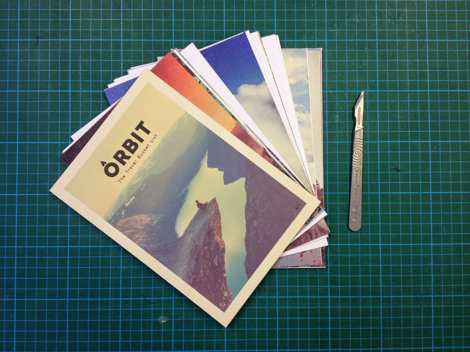
BRIEF 01: FINAL PRINT
After rectifications I printed my final publication in the print room using matt stock so the imagery would not be compromised this time and with the advice of James from the print room, I used a thicker matt stock for the cover so it would be convenient for perfect binding and easy to fold.


I cut out all the pages as single sheets as well as the postcards for the final production of the publication.

I re-printed the Orbit cover due to the back content not being explicit enough on what the publication was about and also because I decided to extend the brief to have an app also.
Binding
For binding I went back to vernon street in the drop in sessions and bound the book following the same steps in the workshop. (I lost the documentation of this process unfortunately)
Overview
The final print and binding of the publication was really successful, due to the mock prints and informing my practice by going to workshops, I was able to create the publication I had envisioned and I am really happy with the outcome.
The only thing I would of liked to have achieved with this publication was an interactional map which if I had enough time to complete would have been a really unique and interesting feature compared to what is already out there in the market.
Thursday, 5 March 2015
Thursday, 20 November 2014
BRIEF 01: LAYOUT FINALISATIONS
Taking on the comments from my previous crit I adjusted the layout further, changed some images and any spelling errors to develop my design further for the final print. Below are some screen shots of what I developed further.
Cover


The cover was the hardest part to develop, so I experimented with a range of travel based photography. From the developments the final design was chosen due to it not being gender based and the warm polaroid style imagery really connected with the other imagery within the publication.
Contents


World Map

London


Reykjavick


New York


Cancun


Rio De Janiero


Cape Town


Cairns


Goa


Hong Kong


Tokyo


Overview
From the mock prints and crits this has been a staple stage in the development of the publication. When working so close to something it's hard to see little details of what can be improved and has definitely been beneficial in the development of Orbit.
Monday, 10 November 2014
BRIEF 01: INTERACTIONAL MAP
As a part of my publication I wanted to create an interactional map, that you can scratch off certain areas to show that you have visited that particular space. I collected a selection of images that rectify this outcome as a sources of influence.


Further Information
I couldn't find any tutorials online of how to do the process, so I took a visit down to the Vernon Street campus and spoke to Andy from the print work shop for some advice on how I could possible execute this design. He gave me a list of materials I would need for the process and how to achieve it.
Tools
Fairy Liquid
Binder
Metallic Powder / Add acrylic for alternative colour
Waxy surface stock
How To
In order to create this scratch map, I have to print my design on the selected stock and then using a fabric screen and the materials above mixed, over print the design, in a layering motion. Before doing my final design its advised that I should create a strip of testers using different ratios of binding. This is also not guaranteed to work with the selected colours you want and would be a trial and error process.
Overview
In finding out about the process and the longevity of it, I felt that this was something that was not essential to the publication. With having limited skills in print work and not really having the time I felt that this was something I will exclude from the Orbit publication as the results of this method were not 100% going to work.
Although this would have been a really nice feature I think focusing all my time and energy into the production of the publication would be more beneficial.
Thursday, 6 November 2014
BRIEF 01: MOCK PRINT — 02
From my initial mock print and development stage, I then decided to move forward with testing out another print with some different stocks. I chose to print of water colour for a tactile quality to the pages and and mount board for the cover for durability.
The following pictures document the process of the pages being cut to size and the book being assembled.


After assembling the book I went through each page and made notes on what pages needed developing further taking into consideration spelling mistakes and image quality.

Action Plan
From the review on the publication I the created an action plan on what I needed to do next in order for the publication to develop
- Rectify spelling.
- Consider alternative stock options.
- Check resolution on imagery on the stated pages.
Overview
The stock chosen for the development of the book didn't allow the ink from the imagery sit very well and a lot of the image quality was sacrificed because of this. I am really happy that I attempted this print before the final because I can now move forwards with other stock options and ensure that this mistake won't happen again. The next stage is to rectify the mistakes I have sourced and move on with the production of the publication.
Subscribe to:
Posts (Atom)