Showing posts with label BRIEF 07 - NSS & YSS. Show all posts

Friday, 6 March 2015

BREIF 07: EVALUATION

Overview

The NSS & YSS brief was initially something that was to be done for a quick turn around with it being a poster brief. However with the designs I had created I wanted to explore on how I could push the campaign further and experiment with the branding of it, due to wanting to work in this field, which is something I am happy I did.

In doing this I feel like I was able to generate another piece for my portfolio in the field of branding and for a reputable institution. I have enjoyed experimenting with the scope of this brief and seeing how I could push my initial ideas across a range of media.


What skills have you developed through this brief and how effectively do you think you have applied them?

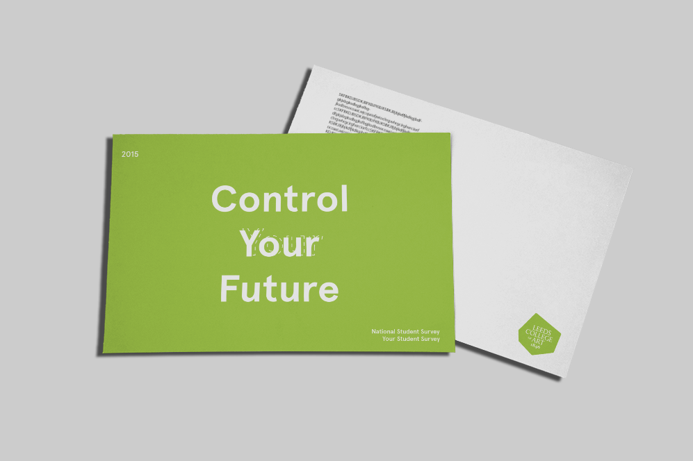
The skills I have acquired through this brief is working with mocking up my work to a professional scale and ensuring that my work transfers consistency across a range of media.


What approaches / methods of design production have you developed and how have they informed your design development process?

The approaches taken for this brief was strictly working digital for the proposed outcomes. I think using mock ups for designs in essential for time efficiency and also can be more beneficial in terms of crafting and consistency. In using these for the majority of the project I will continue to work in this format for the right projects, and in doing this it will allow me to progress in working in this format and my mocks ups will get better in doing this.

What strengths can you identify in your work and how have/will you capitalise on these?

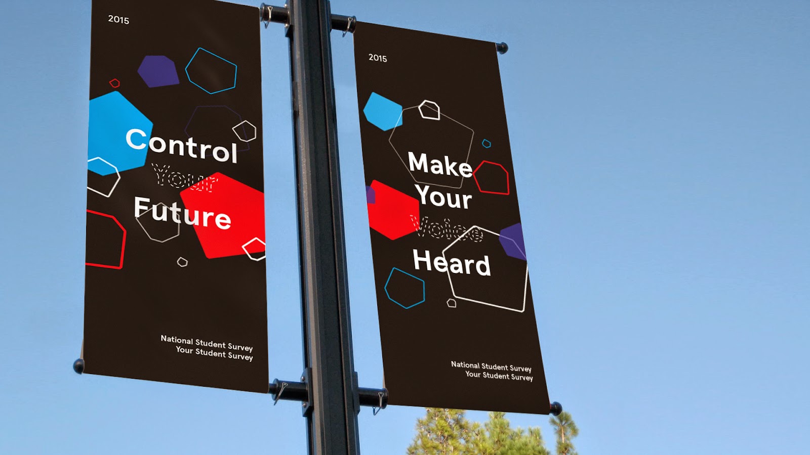
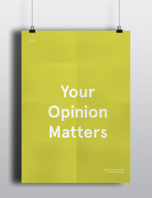
I think the overall branding concept was a strength in this project, I utilised the colleges style and the concept to create an eye catching and modern design. Branding is something I want to work in so doing projects like these and expanding on them allows me to capitalise on these skills.

What weaknesses can you identify in your work and how will you address these in the future?

The weaknesses in this brief was possibly not choosing my final design that I extended. I think if I spent more time on considering the interest of the target audience and developing that design like I did for my final boards I could of potentially won the brief.

For the future I need to ask for more feedback on work from staff and peers to get other opinions aside from my own and to push the development of my work.

Identify things that you will do differently next time and what do you expect to gain from doing these?

Get more feedback on work from staff and peers for my development process, in doing this I think it will help me evaluated my work further with some other input and overall benefit the progression of my designs.


Wednesday, 4 March 2015

BRIEF 07: FURTHER DEVELOPMENTS

Although the brief has been submitted and completed I wanted to extend the brief further by referring back to another design that I was working on and continue to work on developing that further. I decided to mock up my second design in a range of contexts that would be fitted for the brief which is displayed below.


Interior


Information manuals


Online


Exterior


Overview

In extending the brief I believed I created something that was more visually exciting and I wish I submitted this design instead, however I now have this work for a potential portfolio brief and I am happy that I took the time to extend the outcomes to create this!

Tuesday, 20 January 2015

BRIEF 07: SUBMISSION

For my final designs I chose to go with the more simplistic design as initially I felt it would be the easiest to transfer across a range of media.


I sent my email with a short paragraph on my concept and informed them that my mock ups where still in progress.


Mock Ups

I created a  collection of mocked up variations of the designs would work in context, however I wasn't able to send these in time for the deadline, but I wanted to push this brief further to consider how my design would work if I get chosen.

Printed Presence 


Campaign Banner Presence


Online Presence


Feedback


Overview

Through my design I think in the short amount of time I had for the brief I created a range of outcomes suitable for the brief. However in hindsight I do think I should have chosen another design that I was working on. I think the design I went forward with with a bit to minimal and it could have done with some more engaging visuals with what I did in some of the other outcomes. Also I think if I sent over some more mock ups with my initial poster this could have benefited the presentation of my work. With the brief being mainly about encouraging and egnaging students I don't think these visuals were really strong enough in the end. Although this brief is completed I'm going to push this brief further and develop the other outcomes I created initially again

Wednesday, 14 January 2015

BRIEF 07: COLOUR VARIATIONS

After Identifying my concept I decided to start experimenting with colour variations for the background of the posters to make them stand out. From my concept I wanted to create a bold, fresh and colourful design that took away from the mundane idea of filling out a survey and to visually engage the students around the college.

1. LCA 

My initial colour scheme was influenced by the LCA colour used in their branding, I took to their online website and sampled colours that were used so that the posters would fit within the establishment branding and work cohesively throughout the building.


The colours used were bold and colourful, however with using the LCA branded colours it might blend in with other promotional work that has been used that is not specific to this survey and take away from it's effectiveness.


2. Green Gradient


Considering my concept I wanted to create something fresh and visually engaging, I then decided to experiment with greens and yellows as these colours explicitly represent this. I created a gradual gradient individually on each poster which visually connects the posters but also distinctively breaks them up.


I think this colour choice is bold and works really well to create a set of posters and colours that could visually engage students throughout the college.


3. Patriotic

Keeping in mind that I wanted to use bold colours for these posters, I decided to take on the idea of creating a patriotic colour scheme to fit in with the idea of voting and 'voicing your opinion' for change. I chose red, white and blues to execute this idea.


Tthe colours of the posters really stand out but look a little clinical in my opinion to my previous experiments in the first set of designs. However the second set of designs really work in regards to the colours of the shapes and really stand out.


4. Pastels

Lastly I decided to experiment with a more pastel based colour range to see how this variation and style would differ from bold block colours. I chose light blue, yellow and red as these are differentiating colours that would make the colours.


However I felt the posters did't look as engaging as some of the others and due to the pastel tones with the white type, the typography was quite hard to read and not very legible specifically with the use of yellow.


5. Block

I then decided to experiment with a bright orange colour throughout the posters as this colour is bold and bright which again fits within the concept I had in mind for the brief.


However after the  experimentation, I felt it took away from the 'Voice Your Opinion' message that I highlighted in the brief and was to consistent for what I wanted to achieve.

Finals


Overview

From my variations I felt the 2nd colour variation worked the best as it signified what I wanted to achieve with the brief, were colours I have never experimented with before and worked cohesively together in a fresh and engaging way. With this design decision made I will now look at applying my final poster designs to other mandatories for the brief and mock ups.