Showing posts with label RESEARCH PUBLICATION. Show all posts
Showing posts with label RESEARCH PUBLICATION. Show all posts
Thursday, 21 May 2015
Tuesday, 19 May 2015
RESEARCH PUBLICATION: PHOTOSHOOT
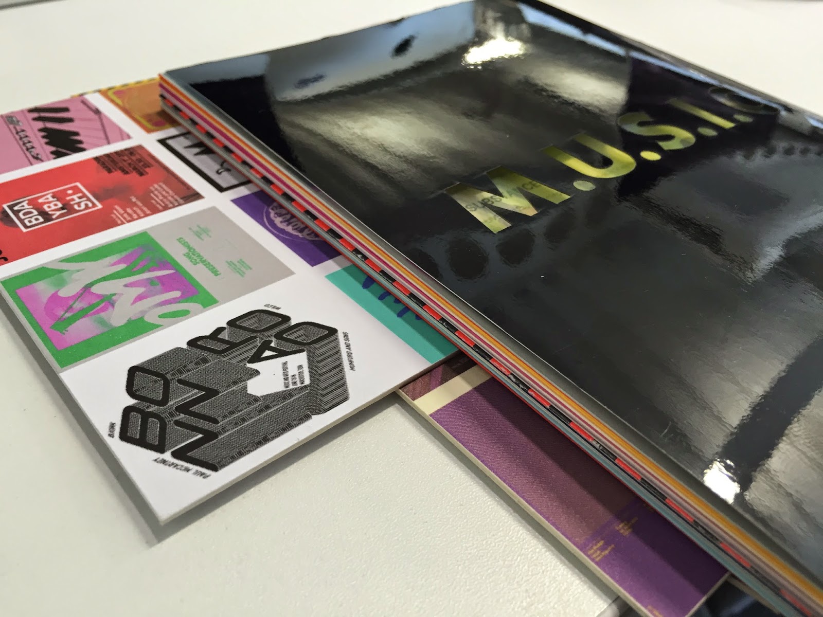
For the research publication I wanted the images to correlate with the content of the book. I collected my secondary research from jumbo records and some old charity shops of some music posters and vinyl that I keep as a part of my inspiration stage of my methodology to create synthesis and visual variation for the photoshoot.

In some free time, I set up photo equipment using different collected stocks and props set up on chip board using an overhead tripod.


Each page of the publication uses a different coloured stock or prop to match the content of the publication and to juxtapose against the the stock.


Overview
The shoot went really, well experimenting with different stocks and props is something i haven't introduced into my practice, so trying something different was a beneficial and added visual depth to the imagery! This is something I will consider in my future career prospects in art direction.
Friday, 15 May 2015
RESEARCH PUBLICATION: PRODUCTION
Publication


Cover


Binding
For the binding method I wanted to use screw binding but due to the thickness of the publication, I had to go to wood work and get a drill put into it.


Luckily it didn't ruin the pages and looks fantastic.
Overview
I am really pleased with the outcome of my publication as is explicitly shows my methodology and aesthetically fits in with the context of music design! I think the production was made easy due to the way in which I designed the publication and using single sheets would allow me to rectify pages that could be taken out without affecting the binding.
Also the section of mock prints I did before production was really beneficial in ensuring that the type and arrangement was in the right place.
Monday, 11 May 2015
RESEARCH PUBLICATION: DEVELOPMENT.
For my research publication and looking into visual research I wanted the design to reflect mini music flyers or have music zine qualities to represent my field of interest.
Cover
For my cover design I am considering creating a vinyl cover / laser cut cover that will show imagery of music in action as a gateway or visual representation of a window into the culture of music.


I then started to experiment with the idea of creating a poster style line up for the contents page and adding other music orientated features such as a track listing for the page names and numbers.


Insert


Understanding


Cover
For my cover design I am considering creating a vinyl cover / laser cut cover that will show imagery of music in action as a gateway or visual representation of a window into the culture of music.


I started my developments through experimenting with the book title name M.U.S.I.C, the full stops are within the title to hight the break down of my methodology and that each letter stands for another word.

I then tried an alternative outlook on the cover by incorporating some of the most influential flyers and posters I have sourced over the years. This will be used with the laser cut typography of the name.
Contents
For the contents page I wanted it to be laid out like a concert listing or festival line up, again to synthesis with the theme of music. This page will use a bold or neutral stock.

I started the design off by simply detailing what I needed on the page.


Insert
A insert of gig photography would be put over the content page to make the poster look more authentic.

Acetate or true grain stock will be used for the insert.
Introduction
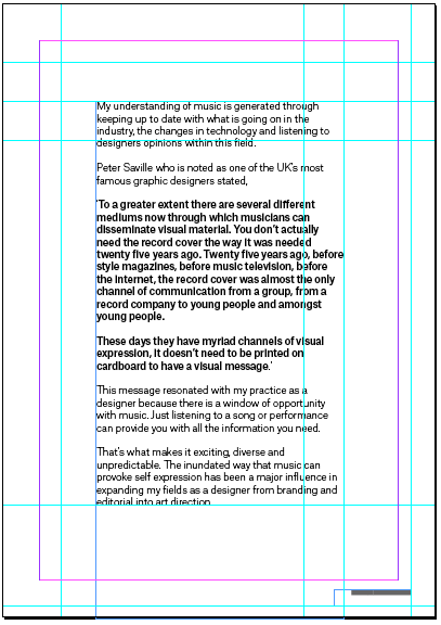
For my introduction I wanted to keep this quite simple as I wanted the audience to primarily focus on the written content.


I started by adding some content about what the publication was about and how it relates to my practice.
Methodology


For the understanding sector of the publication I collated information about what I have learnt about the music industry including quotes from theories and designers that have been sourced from my dissertation.


The understanding section is concluded with how this section of my methodology has been executed in my practice with some imagery and background on the brief.
Substance


Mock Print
With the development of the publication I decided to do a mock print to see if the alignment would be okay for the screw binding.


Without binding the pages the writing was too close with the edge, so in the development of the publication I will move the content to centre.


Finally I experimented with a ring binding method, that could possibly be used to change the publication into a festival lanyard.
Inspiration


Create


Outro


Back

Overview
Subscribe to:
Posts (Atom)