Showing posts with label BRIEF 15 - MARCUSSONGS. Show all posts
Showing posts with label BRIEF 15 - MARCUSSONGS. Show all posts
Saturday, 14 March 2015
Friday, 13 March 2015
BRIEF 15: EVALUATION
Overview
Overall this brief was a nice and simple brief with a quick turn around. expanding my clientele in the music industry is something I am continually doing this year and it something I am throughly enjoying which is something that will be beneficial for my future.
The skills I have developed through this module is working with two different clients at once, trying to comply with two people tastes and styles. This was something I thought initially would be really hard, but through consistent communication, this brief was a success and both parties where happy.
The approaches to design production for this brief was working with Photoshop actions to create a vintage polaroid style for the poster, this is something I have never really used before, in regards to actions and by exploring this it allowed me to create the design a lot more quicker and will be something I will look into further to help allow my design process quicker.
I would spend more time developing outcomes for my posters, to ensure that I have experimented with all my potential outcomes so that I can ensure that I have pushed the brief the furtherest.
Finally I would of liked to expand the brief and work more with Jaded magazine, however the opportunity I had was a step in the right direction and now I have the connections and clients to collaborate with in the future. I also would of liked this brief to paid, however sometimes getting your work featured is an important way to allow people to recognise you as a designer and to gain more clients and interest.
Overall this brief was a nice and simple brief with a quick turn around. expanding my clientele in the music industry is something I am continually doing this year and it something I am throughly enjoying which is something that will be beneficial for my future.
What skills have you developed through this brief and how effectively do you think you have applied them?
The skills I have developed through this module is working with two different clients at once, trying to comply with two people tastes and styles. This was something I thought initially would be really hard, but through consistent communication, this brief was a success and both parties where happy.
What approaches / methods of design production have you developed and how have they informed your design development process?
The approaches to design production for this brief was working with Photoshop actions to create a vintage polaroid style for the poster, this is something I have never really used before, in regards to actions and by exploring this it allowed me to create the design a lot more quicker and will be something I will look into further to help allow my design process quicker.
What strengths can you identify in your work and how have/will you capitalise on these?
The strengths I can identify in my work is working with type and image, from all my brief this is something I excel in and feel confident to tackle any brief that includes these features.
The strengths I can identify in my work is working with type and image, from all my brief this is something I excel in and feel confident to tackle any brief that includes these features.
What weaknesses can you identify in your work and how will you address these in the future?
The weaknesses in this brief was that I felt that I could developed the poster designs a lot more further, but with the client being happy with my initial ideas it didn't need to be pushed further. However in doing poster brief in future I can prevent this weakness by spending time on creating more thumbnail designs and researching into more typography to help further my artwork.
Identify things that you will do differently next time and what do you expect to gain from doing these?
Finally I would of liked to expand the brief and work more with Jaded magazine, however the opportunity I had was a step in the right direction and now I have the connections and clients to collaborate with in the future. I also would of liked this brief to paid, however sometimes getting your work featured is an important way to allow people to recognise you as a designer and to gain more clients and interest.
Thursday, 12 March 2015
BRIEF 15: FINAL POSTER
For my final poster design I created a range of poster mock ups, influenced by wheat paste mock ups that are generically used for gig posters.


Overview
Putting my designs into context has really enhanced the overall look of them and by doing this it really makes the work look more professional. Although this is just a poster brief I think by applying to the design in different situations allowed the design have more visual variation.
Monday, 9 March 2015
BRIEF 15: CLIENT FEEDBACK
From my poster developments, I decided to send over some of the designs to Lisa and Marcus for some feedback to see if this was what was they where looking for, in the form of a pdf.
Feedback
In speaking to Lisa, I received some really positive feedback 'Awesome, thanks so much for this. You've done a great job!' which was great just for some initial designs.

She chose to move forward with this design for the magazine and didn't want any changes to the design!
Overview
I think I would have liked push this design a little further as I only developed it a little bit, however the client was really pleased with my initial outcomes which was positive and time effective.
Saturday, 7 March 2015
BRIEF 15: POSTER DEVELOPMENT
For the brief I was sent over some photography to work from, taken by Lisa Erico. With Marcus wanting the images in a polaroid style I had to find some ways that I could experiment with this style of photography.
Photography

In researching into some photoshop tutorials I found an action button that automatically transformed imagery into polaroids which was a quick and effective and successfully transformed the images into this style with vintage filters.


Poster
To start the poster design I set up an A3 Document and worked in monochrome just as an initial starting point, experimenting with type and image layout.
From my visual research I thought i'd experiment with the stacked style as it seemed the easiest to created for an initial starting point.


I started experimenting with a stacked style of photography and incorporating the type that Marcus requested for the poster. This arrangement could be capitalised on either with a bold colour similar to the tones for the photography or in the typography to really stand out and to enhance the retro style design. For my initial design I used the font 'colours of autumn' as it's a script style font that I thought would also add a personalised tone from what I saw in my visual research.


I then started to experiment with using a multitude of the polaroid on one page as another experiment from my visual research.


However after arranging the images I felt that the layout didn't really work and look overcrowded, plus there was a lack of alternative imagery so it just looked a bit repetitive. So I decided to experiment with another visual idea.
Taking one of Marcus's images I decided to try using a bold background with a polaroid overlay. I blurred the background image slightly and arranged the polaroid over the top to look as though Marcus was holding a Polaroid over his face. From my other developments I felt that this one was much more visually striking and the bold colours really worked well together and the contrasting focuses to create a more modern and realistic polaroid design.

From the initial designs I decided to experiment with an alternative typeface for visual variation, I worked with 'Didot' as it works really well with typography and creates a sophisticated and modern aesthetic. I also decided to experiment with the same design in monochrome with bold coloured typography as another alternative for Marcus and Lisa to look at.
Overview
With only receiving a little bit of info on what the client wants I thought that I would create a few simple designs to see if I am on right track in regards to visual style and concept. With the brief being quite small i have the opportunity to create designs in a quick turn around for constant feedback, so I will sen dover a few designs for some feedback and how I can push the brief further.
Thursday, 5 March 2015
BREIF 15: VISUAL RESEARCH
I collected an array of images that used polaroid qualities, as a source of influence of image manipulation and layout.


These collection of images experiment with a multitude of polaroids on a page and really work in enhancing the overall visual image or creating and interesting guide to work by. This is something I can experiment with, for the layout of my design.


A collection of great ways to showcase a few different pictures while leaving in a striking, strong background image to tie them all together! landscape photography, abstract art and graphic overlays are a great match.
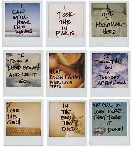
I really like the hand written font on the polaroids which creates a personalised effect, also this style of font enhances the vintage element.


Marc Jacobs campaign simplistically works with using layout and type arrangement to create a polaroid style grid, this is also something I can consider if putting the images into polaroid frames isn't successful.

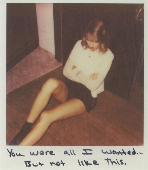

Musicians such as Taylor Swift and 5sos also used this method of design for their promotional material, these artists also use a handwritten style font, experimenting with just one polaroid image or a multitude.
Overview
From this visual research I've found a multitude of ways I can experiment with type and layout for Marcus's poster design and also reflect on how other musicians have used utilised this style. I will now move forward with experimenting with different designs.
Wednesday, 4 March 2015
BRIEF 15: ARTIST POSTER
Today, I was speaking to Lisa about a potential poster design for one of the artists feature in her magazine, 'Jaded'. I was put into contact with Marcus Songs who then gave me some information about himself and what he wanted. I spoke to Lisa through Facebook as this was her main platform to talk on with the magazine information being on a Facebook page. Below is a transcript of what was needed from the brief
Contact
Lisa:
Contact
Lisa:
Hey guys, just wanted to discuss the music poster for Marcus and I thought it would be easier if we could all do it on this convo. To introduce you both, Marcus is a student at LCM who I have been helping with promo shots. J'nae is the graphic designer who is interested in helping out with some design work like posters/ album covers that can be put into the magazine. It would be great if you two could chat about different ideas and of course I will provide the photography for the artwork. The link for them is on the 'Jaded magazine' group. I will tweak a few of them again because my colours on my laptop are seriously out of whack.
Marcus:
ive been trawling the internet for inspiration; im personally not very picky but i essentially just need some 'marcussongs' text overlaying perhaps with a music note in there somewhere; maybe some song titles... 'like that' , 'don't look now' available now; itunes logo etc. Maybe something that's like on a fake polaroid print, Maybe a landscape one with social media information and the twitter, youtube, facebook and instagram logos.
After getting some brief ideas, I then decided to re-write the brief as a guideline for myself to ensure that I could work to some requirements and to plan my design and time effectively. I was also sent over some artwork to work with for the brief i the form of photography of the artist.
Brief

Brief
Overview
By writing out the brief and setting my own personal deadline, I think that this brief can be done in a quick and efficient way. With have two client for the brief I will be able to receive a lot of feedback and this will also help with the development of the project.
Saturday, 28 February 2015
BRIEF 15: JADED MAGAZINE
Today I received an email from my Lecturer John about a possible collaboration with a student running a local music magazine. I felt this brief would be a perfect opportunity for myself due to my interests in branding for the music sector and editorial. Below are some emails with john discussing my interest.
Contact


I then contacted Lisa who was in charge of the magazine about some potential work, however she had a high volume of interest and had already selected people to work with. A few weeks later she then asked if she would like me to contribute with designing a poster for one of the artists she was going to feature in the magazine.


Overview
Although this was not what I initially wanted to do and wanted a bigger role, I though that working with Lisa and the artist would be a great networking opportunity to create contacts within this field of interest and would be a quick turn around brief, which would be good for creativity.
Subscribe to:
Posts (Atom)