Showing posts with label BRIEF 05 - PETER & PAUL. Show all posts

Tuesday, 10 February 2015

BRIEF 05: EVALUATION

Overview

The Peter & Paul white wall brief was a brief I really was interested in from the start but due to the deadline being near the COP 3 hand in I initially couldn't take on the brief. However the deadline was pushed back I decided to take it on as a collaboration with Sam Cook. This brief was a quick turn around brief, were decisions had to be made quickly and although it was a mini brief I really enjoyed working to a close deadline and seeing what could be achieve in just under 48 hrs.


What skills have you developed through this brief and how effectively do you think you have applied them?

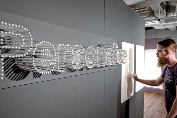
I think my skills are still prominent in typography layout and art direction and I applied these skills through the arrangement of typography and also with Sam creating other 3D / Physical elements to our presentation and thinking beyond just a digital presentation.


What approaches / methods of design production have you developed and how have they informed your design development process?

A design production method I have developed in this brief is the use of stock! Throughout my time on this course I have never used neon materials and using them for the first time was really interesting to see how light and arrangement can enhance a design and this case I felt we pushed the way typography could be viewed in a crafted way.


What strengths can you identify in your work and how have/will you capitalise on these?

The strengths within this brief was working together with Sam, we both were motivated to get the work done to best possible standard and both shared the same enthusiasm for the project.

Another strength I think I have gained from this project is my typographic pairing, although I used type quite often I usually stay away from serif font's and I think by experimenting an incorporating juxtaposing font's added a alternative visual value.

Lastly I think a strength of mine is to always think of how to make a brief stand out or different, I think that by myself and Sam creating physical mock ups for our presentation was something no-one else did and gave a interactional and real life element to our project.


What weaknesses can you identify in your work and how will you address these in the future?

I think the weaknesses in this brief concept development, although we had quick turn around I think if myself and sam had more time we really could have pushed this a lot further. 

Workshops like laser cutting were not available at the time for us to create the exact design we wanted also, but from the feedback and reflecting on the brief I definitely think we could have spent more time researching and building our concept more!

However for the time in which we had, we thought we should focus on something minimal and simplistic that would work for longevity.


Identify things that you will do differently next time and what do you expect to gain from doing these?

Do more concept building and design developments for future pitches! I think sometimes having a one idea but in different sizes would have been beneficial even if the design wasn't completed finished. 

I definitely want to ask more visiting professionals for one on one feedback as I think for this brief it was beneficial to see where we went what and what we would of considered, and the comments from Lee is something I will take on in the future for design work and pitches.

Monday, 9 February 2015

BRIEF 05: PRESENTATION BOARDS

BRIEF 05: FEEDBACK

Today we received some feedback from Lee from Peter & Paul on our presentations and find out if we had won the brief. We had individual crits and unfortunately we didn't win the brief but I think the work myself and sam produced in one day was really substantial and a good effort. If we had spent longer on the brief I believed our idea could have excelled and be generated into something more exciting. 


Feedback

  • Good starting point
  • Presentation was too focused on materials which lead down an alley
  • Good use of a real life mock up
  • Directional signage piece that could have been expanded
  • Lacked in content
  • Functional over visual

Overview

I felt the feedback was fair in what it was stating and I feel that the brief could have been a lot pushed further. I think getting feedback from visiting professionals is really good for my practice as a design about to go into industry it's imperative to know what I can improve and develop upon before I leave uni. With this said I will focus on the points stated and take this advice on through my other briefs.

Wednesday, 21 January 2015

BREIF 05: DEVELOPMENTS

For our concept we wanted to use neon acrylic to build our mock up, however due to time we had to find a another alternative.


So myself and sam started to experiment with neon paper to generate mini mock ups for the presentation.


We printed the design onto neon paper, applying it to card and using foam board cubes to mount it onto the wall. The letters started glowing neon orange which is exactly what we wanted to achieve.

We then arranged the letters out focusing on creating a realistic mock up for wall A which is the board outside of the Level 06 design room.


Wall A 1:


Wall A 2:


With some left over materials, we then decided to create a letterform mock up out of wood to show a more realistic idea of how thick the typography would be and to also show how adaptable our design is on a multitude of materials.


Overview

Overall we our concept worked well within the real setting of the university and glows in natural light which is something we wanted to achieve though neon signage. However I wish we had more time to create the mock up for Wall B and experiment further with vinyl type, but due to the time scale in which myself and sam decided to do this brief we didn't give ourselves enough time to achieve this. None the less I am really pleased with what we have achieved in a quick turn around brief.

BRIEF 05: TYPOGRAPHY LAYOUT

The visual concept for the brief was to take on a minimal approach so the design would be for used for longevity and was adaptable to the changing events and space. With this in mind myself and sam decided to use a typographic design that used the graphic design course name, room numbers and quotes about what the students thought about the course.

Below are some visual variations that I created for the walls using 'DIN Bold' and 'Adobe Garamond Pro' for visual variation and legibility.

Wall A: 


Wall B: 


After generating a few design outcomes, we presented our work and from the work we had done, we decided to work with the following typographic designs and experiment with mocking them up with our concept.

Finals


Wall A: 


Wall B:


Overview

With the brief being so close to it's deadline, myself and sam have to make quick design decisions and although we have thought of something quite quickly, I think that the simplicity and the proposed materials will make the concept really stand out and will last a long time

Tuesday, 20 January 2015

BRIEF 05: CONCEPT

In graphic design, There is always more that what meets the eye. This course has allowed us to see the multitude of avenues that we can evolve and experiment in to be a designer. 

This concept is demonstrated through a  A 3D Type installation, with backlighting created through neon perspex or spray paint to give the typography visual depth. 

What ever angle you look at the type it enhances the idea that it will always stand out from the mundane and challenge your perspective.

The layered type represents the evolution of a designer building up on their skills on the course and bold orange signifying growth and adventure.

The bold typography is accompanied by vinyl words that students have used to describe or experiences that have felt on the course to give a more communal and student perspective approach sharing our ideas as a course.

Our design is simple but effective and is transferable to any location within the graphic design department for longevity.


BREIF 05: VISUAL RESEARCH

To start the brief myself and sam researched into a selection of signage and type examples for inspiration for this project. We knew that we wanted to work with type as this is our strengths as designers.


The use of a bold neon colour would add depth to a plain white wall and make it stand out in the graphic design department.


Acrylic signage is an alternative material and long lasting, this material could possibly work in the department and will be good for 3D signage.


A interactional feature on the wall like shelves to hold students artwork or notices would also contribute to the space and even student contributions like words to describe the course could be used as an extra in vinyl.


Alternative materials like wood and metal would also be really interesting to work with and the angles / depth of type could be enhanced by this.


Overview

In looking at these examples we decided on focusing on a 3D type installation that would work in the graphic design area. Considering the limitations of the brief and the visual research we looked into we really like the idea of neon signage to bright up the space, however lit signage costs a lot of money. With this in mind we decided to experiment with colour card and spray paints on the back of the type that would reflect on the walls from natural light which we be a lot more cheaper.

Monday, 19 January 2015

BRIEF 05: PETER + PAUL INTERIOR WALL COMPETITION

The Peter + Paul brief, really intrigued me when it was first pitched as my interests within design lie with art direction and curation. However due to the deadline and having COP 3 I initially couldn't take on the brief. But luckily the deadline was pushed back so I decided to take it on as a collaboration with Sam Cook.

Brief


Overview

Although the deadline is in one day I think myself and sam as a collaborative will be able to create something substantial, regardless of time.